Graphics: Plots in Python (Matplotlib) with LaTeX formatting
Creating plots in Python (Matplotlib) using LaTeX for axis labels, titles, and legends.
Previously, I showed how I create graphics by scripting them in MATLAB. Now I show the same in Python. In both cases, it is possible to use LaTeX for axis labels, titles, and legends.
Python is a general-purpose computational environment, so you can first perform calculations and then generate plots.
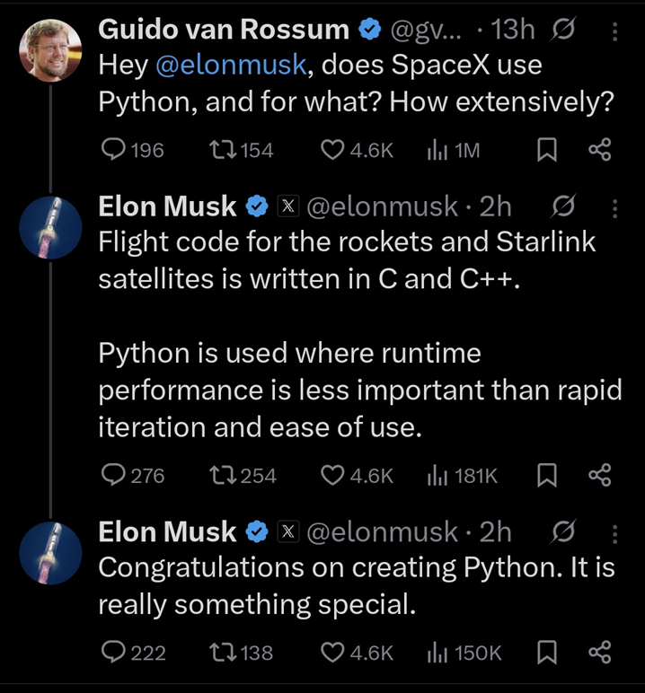 Fig. 1. Power of Python. Source: X (Guido van Rossum, Elon Musk), 2026; screenshot (author unknown).
Scripting allows generating high-quality graphics using mathematical notation and code.
In this post, I show an example plot in Python using the Matplotlib library. The figure contains the most important elements in a single plot.
Damped oscillatory waveform in Python
Below is an example plot saved as a PNG image for embedding on a website and as a PDF file for embedding in a LaTeX document.
The plot shows the function:
\[i(t)=I_\mathrm{m}\cos(\omega t)\,\mathrm{e}^{-t/\tau}\]where:
- $I_\mathrm{m}$ – amplitude at $t=0$ [p.u.],
- $f$ – frequency [Hz],
- $\omega = 2\pi f$ – angular frequency [rad/s],
- $\tau$ – time constant [s].
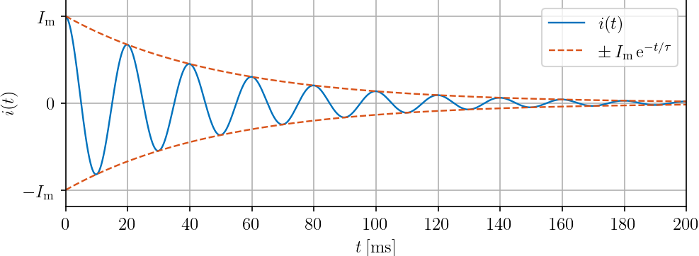 Fig. 2. Damped oscillatory waveform.
Files used in this example:
Python code
Example plot containing the key elements: waveform, envelope, axis labels, and legend.
Key setting: text.usetex = True, which enables LaTeX rendering for text elements.
The description is provided directly in the code comments.
1
2
3
4
5
6
7
8
9
10
11
12
13
14
15
16
17
18
19
20
21
22
23
24
25
26
27
28
29
30
31
32
33
34
35
36
37
38
39
40
41
42
43
44
45
46
47
48
49
50
51
52
53
54
55
56
57
58
59
60
61
62
63
64
65
66
67
68
69
70
71
72
73
74
75
76
77
78
79
80
# Imports
import numpy as np
import matplotlib.pyplot as plt

# Rendering settings (LaTeX + global style)
plt.rcParams.update({
    "text.usetex": True,
    "text.latex.preamble": r"\usepackage{amsmath}",
    "font.family": "serif",
    "axes.labelsize": 12,
    "font.size": 12,
    "legend.fontsize": 12,
    "xtick.labelsize": 12,
    "ytick.labelsize": 12,
    "lines.linewidth": 1.15
})

# Signal definition (damped cosine current)
Im  = 1
f   = 50
w   = 2 * np.pi * f
tau = 0.05

t = np.arange(0, 1 + 1e-4, 1e-4)

i = Im * np.cos(w * t) * np.exp(-t / tau)
envelope = Im * np.exp(-t / tau)

blueColor = (0.0000, 0.4470, 0.7410)
redColor  = (0.8500, 0.3250, 0.0980)

# Figure and Plot
plt.close('all')
fig = plt.figure(figsize=(500/72, 200/72), dpi=72)

hp1, = plt.plot(t, i, color=blueColor)
hp2, = plt.plot(t, envelope, '--', color=redColor)
plt.plot(t, -envelope, '--', color=redColor)

# Axes configuration
plt.grid(True)
plt.xlim(0, 200e-3)
plt.ylim(1.19 * np.array([-1, 1]))

# Ticks
xtick_values = np.arange(0, 200e-3 + 1e-9, 20e-3)
plt.xticks(xtick_values, [rf'${int(x*1e3)}$' for x in xtick_values])
plt.yticks([-1, 0, 1], [r'$-I_\mathrm{m}$', r'$0$', r'$I_\mathrm{m}$'])

# Labels
plt.xlabel(r'$t\:[\mathrm{ms}]$')
plt.ylabel(r'$i(t)$')

# Title
plt.title(r'$i(t)=I_\mathrm{m}\cos(\omega t)\,\mathrm{e}^{-t/\tau}$')

# Legend
plt.legend(
    [hp1, hp2],
    [r'$i(t)$', r'$\pm\,I_\mathrm{m}\,\mathrm{e}^{-t/\tau}$'],
    loc='upper right'
)

# Layout
plt.tight_layout()

# Export (vector PDF + raster PNG for web)
plt.savefig(
    'current_oscillatory_waveform.pdf',
    bbox_inches='tight',
    pad_inches=0
)

plt.savefig(
    'current_oscillatory_waveform.png',
    dpi=150,
    bbox_inches='tight',
    pad_inches=0
)
plt.show()
Notes on the example
The code is a direct counterpart of the earlier MATLAB example, but written in Python using Matplotlib.
Some practical notes:
NumPyis used for numerical computations,Matplotlibis used for plotting,plt.rcParams.update(...)sets the global plot style,text.usetex = Trueenables LaTeX syntax in axis labels, legends, and titles,plt.savefig(...pdf)saves a vector graphic (PDF) for use in LaTeX documents,plt.savefig(...png)saves a raster image (PNG) for use on web pages.
Note that with usetex enabled, Python uses an external LaTeX installation (compilation via pdflatex). This means a working LaTeX distribution must be available on the local machine (e.g. https://www.tug.org/texlive/).
Plot preview next to code (VS Code)
It is convenient to view the code and the generated plot side by side.
I use a simple layout in Visual Studio Code:
- Remove
plt.show()from the script. - Open the project folder (
Ctrl+Shift+E). - Open the
.pyfile. - Split the editor:
Split Right(Ctrl+\), or useSplit Down. - Open the generated
.pngfile.
After running the script, the preview updates automatically.
This is how it looks:
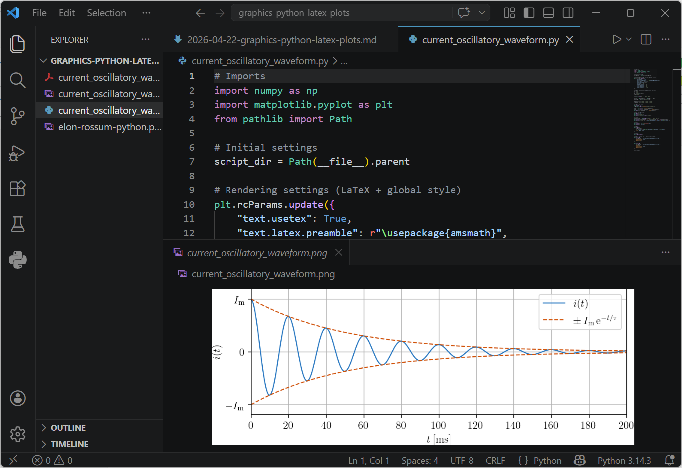 Fig. 3. Plot preview in VS Code.
Summary
The scripting approach provides repeatable and high-quality plots.
Code → plot → done.